Valet Living
Identity Guidelines
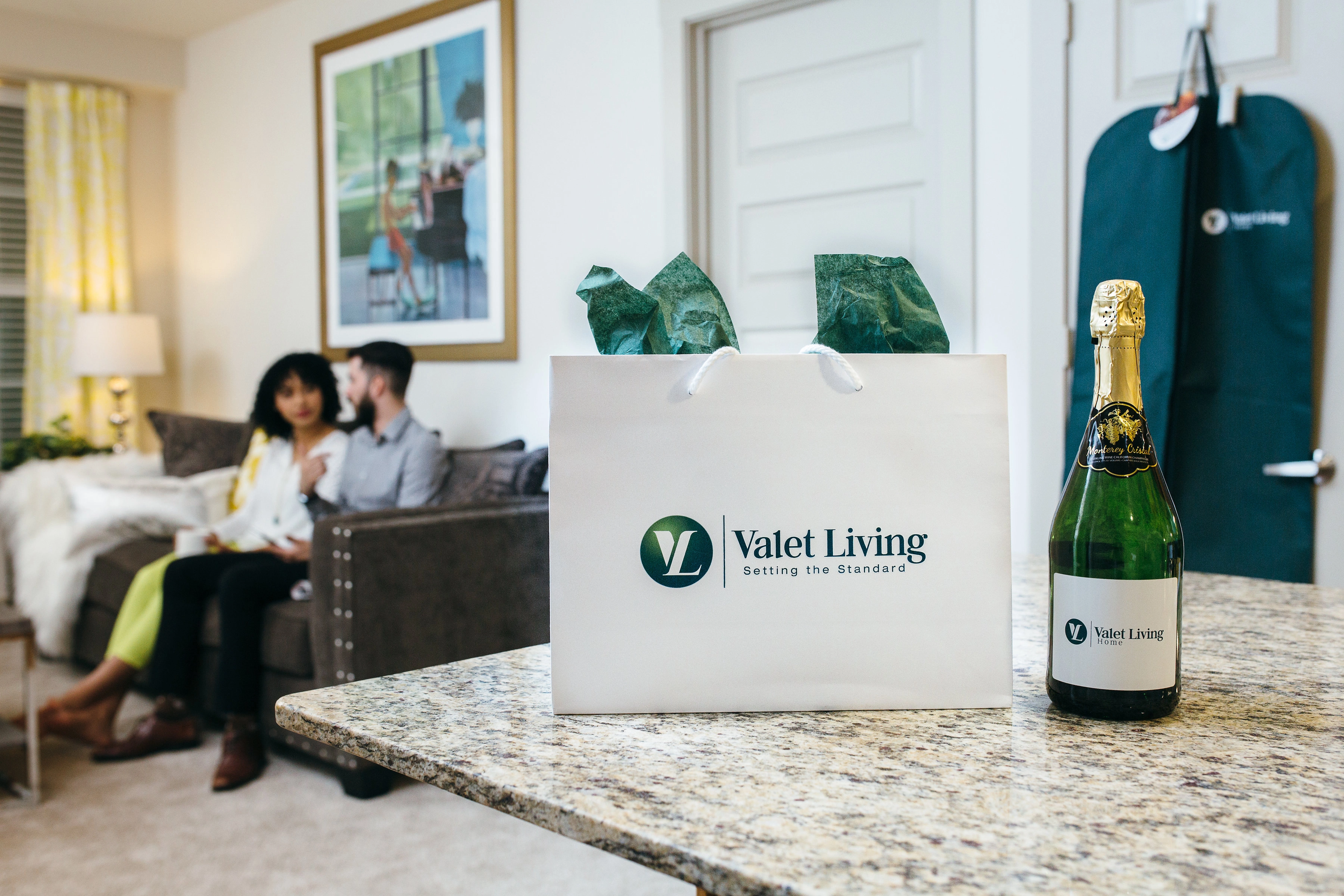
Valet Living is so much more than the valet trash and recycling collection industry it created. Our vision of “Living made easy” is possible because we are the leader in multifamily amenities delivered through various products and services that give our clients and residents more time in their days.
When writing, emailing, presenting, talking or creating any written content or presenting verbal communication, always use our full name, “Valet Living.”
- Never “Valet” only. We are not a valet company, so Valet should never be used alone, without Living.
- Never “VL.” Use of the acronym “VL” is also unacceptable as two letters mean nothing to our clients, residents or associates. Always use our full Valet Living name.
The Valet Living Main Logo
The Valet Living logo is the most valuable asset of our visual identity and should be protected as an instantly recognizable symbol of the brand.
It has been designed to visually represent our promise – “Setting the Standard for Residential Living.”

Components
Our logo is made up of two components – the “monogram” and the “wordmark.” These components are fixed in size and position relative to one another and should not be altered in any way.
The monogram and wordmark should not be separated from each other, with the rare exception of using the monogram as an icon within digital applications such as app icons, social media icons, or the favicon for the web browser.
Exclusion Zone
A minimum clear space around the Valet Living logo must be maintained to ensure visual impact. The dotted lines below indicate the exclusion zone, the minimum space into which no other visual elements should be placed. However please keep as large of a clear a space around the logo as possible.


Color Variants
The Valet Living logo should never appear in any other colors or combinations than the three shown above.
Unacceptable Uses
It is crucial for brand success that the logo is displayed correctly. The examples illustrate unacceptable uses.
- Do not rearrange or separate the monogram (circular mark) from the rest of the wordmark
- Do not rotate or tilt the logo
- Do not alter the color of the logo
- Do not remove the slogan, the word “living” or any other element of the logo
- Do not alter the type style (e.g., from cap/lowercase to all caps or a different font)
- Do not attach another slogan or image to the logo
Download the Valet Living Logo
Fonts and Color Palette
Open Sans is our primary typeface
(Use whenever available for printed marketing collateral, stationery, website, etc.)
Open Sans
ABCDEFGHIJKLMNOPQRSTUVWXYZ
abcdefghijklmnopqrstuvwxyz
1234567890!@#$%^&*()
Calibri is our alternate typeface
(Use Calibri whenever Open Sans is not available. Because Calibri is loaded on most systems, it will likely be the font available in Word, PowerPoint presentations, etc.)
Calibri
ABCDEFGHIJKLMNOPQRSTUVWXYZ
abcdefghijklmnopqrstuvwxyz
1234567890!@#$%^&*()
Always use Open Sans font (or Calibri as a second choice) in all written communications.
Because all capital letters (i.e., ALL CAPS) are harder to read, they should not be used in sentences or body copy – and used sparingly in headers. Since underlines are used to denote a live web link, do not underline words or phrases in body copy unless it is to showcase a link.
Valet Living Green
#006666
PMS 3292
c100/m40/y67/k33
r0/g92/b86
Living The Brand
Branded Materials
Valet Living associates have access to our internal brand asset management system. This system allows you to access, customize and order materials like sales sheets, event templates, resident memos, pitch decks, brand photos and more.
